


Everything a product is made of
This shop is one of them: every page of Stokefy, its cart and its checkout included, is built with OS.
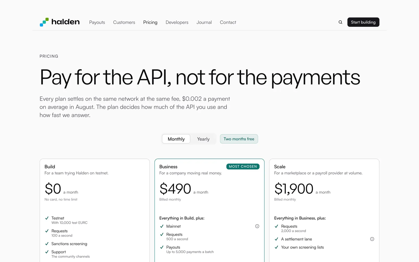
A website
A landing page, pricing, a journal, careers and help: the pages a company needs, ready for its words.
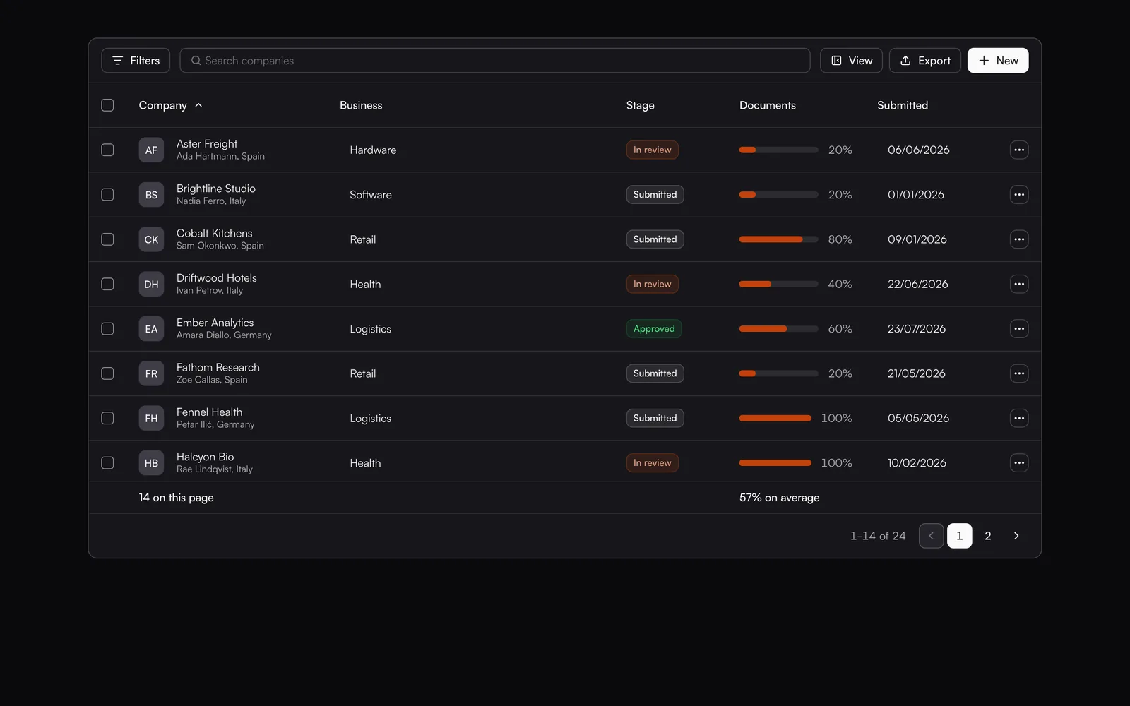
An app
A home of numbers, lists that filter, sort and select, records and settings, in a shell that holds still while the work scrolls.
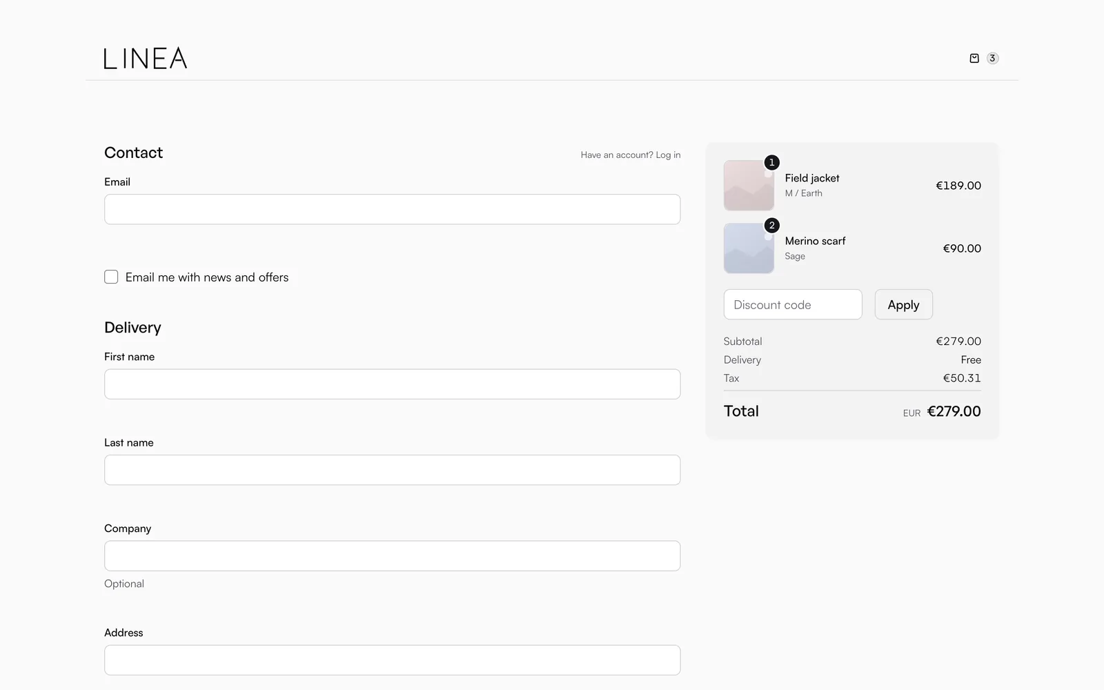
A shop
A catalogue, a product page, a cart and a checkout, with the cards your buyers pay with.
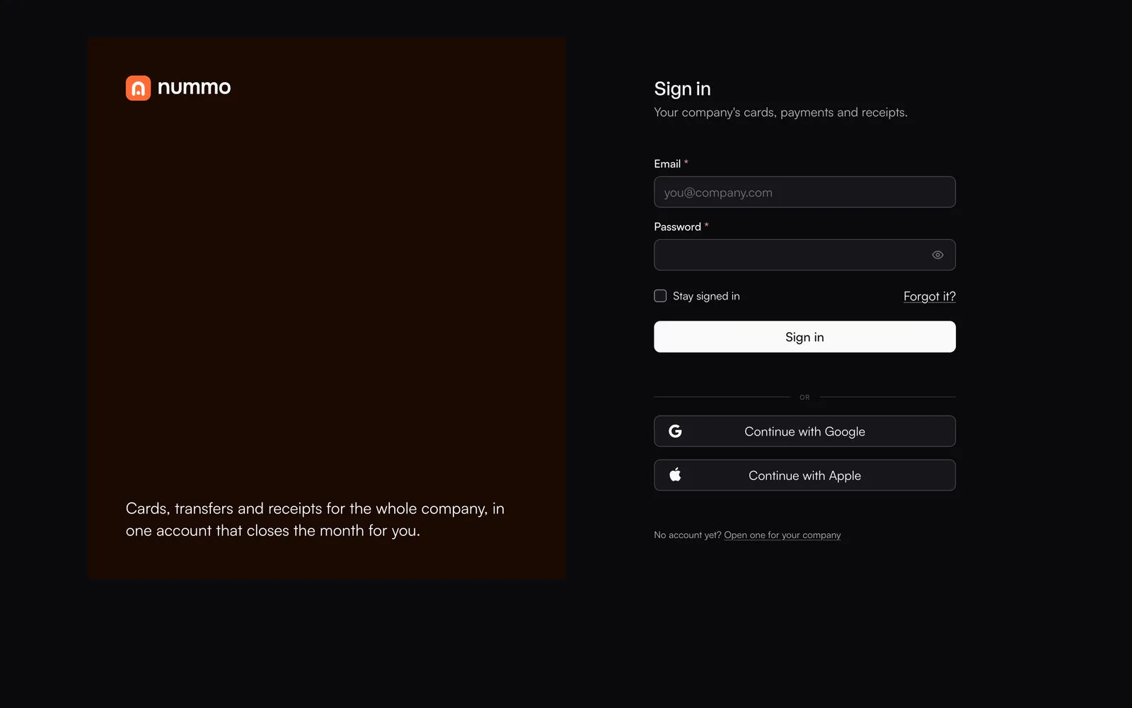
A way in
Sign in, sign up, a code from an app and a lost password, one step to a screen.
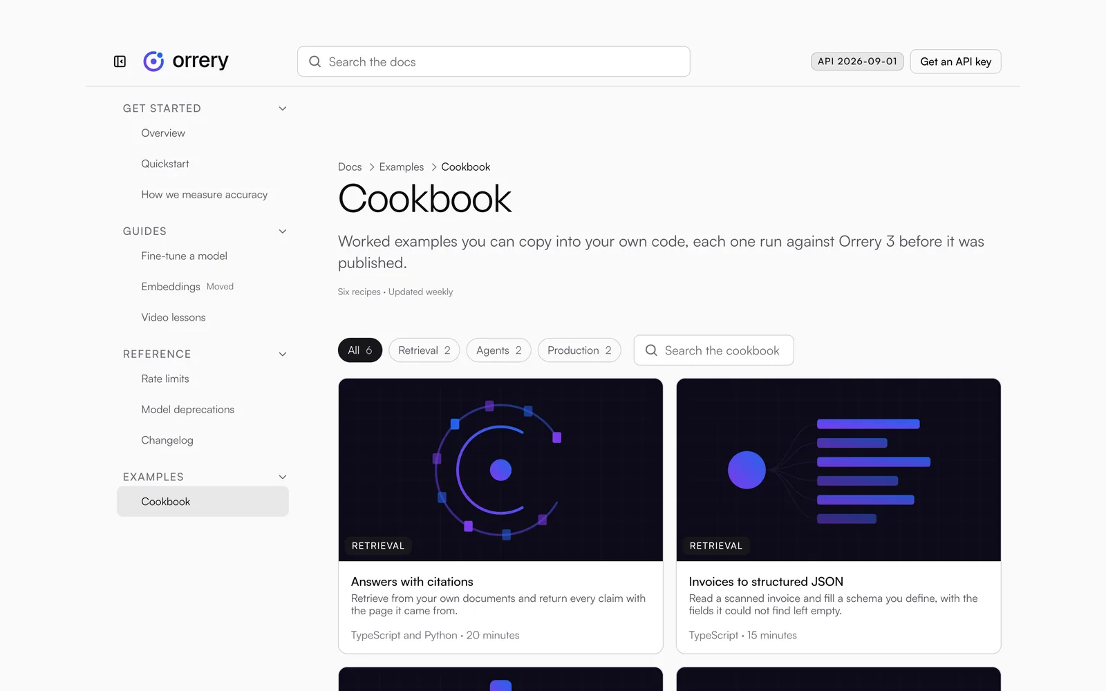
Documentation
Guides, a cookbook and a changelog for your own product, with a column of contents that follows the reading.
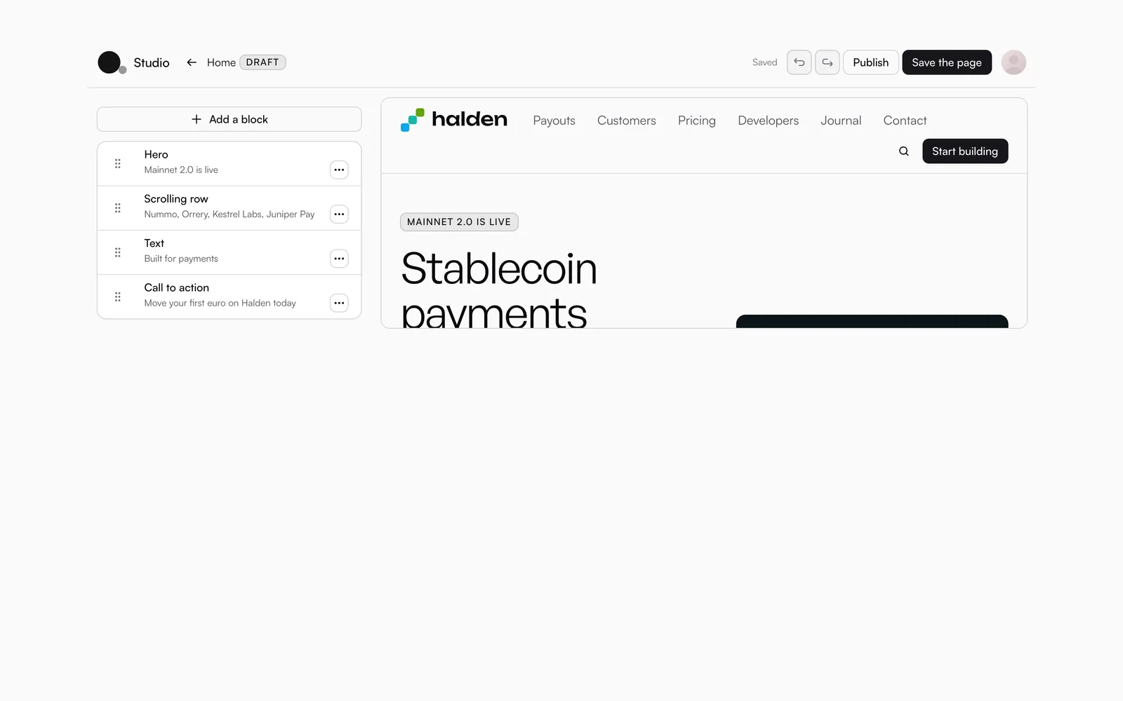
A page builder
The blocks a page is made of and the editor that arranges them, so a page is made without writing it.
Ready for your AI coding tools.
Claude Code, Gemini CLI, Cursor, Codex and Copilot read the rules OS comes with before they write a line, so what they build is OS, not a guess at it.
# Building with OS

## Six rules

1. Use the component OS has for the job.
2. Say what the screen is first, then use OS's screen for it.
3. Ask for decisions, never numbers.
4. Arrange with Stack, Row and Grid.
5. Never restyle a component from outside.
6. Run npx os-check-screens before the build.npx os-check-screens src
os-check-screens: 92 files read under src
OK every screen opens once, no sheet in a card,
no strip over a sheet, fields a block apartThe rules where the tools look
AGENTS.md, CLAUDE.md and GEMINI.md for your project: which screen for which page, which prop for which decision, and what never to write by hand.
A live connection
npx os-mcp lets Claude Code, Cursor or Gemini CLI look a component up while it writes, from the version you installed, with nothing to host.
Every component in plain text
A page for each component, with what it is for, its props, their types and defaults, and its PHP signature, all indexed in llms.txt.
One vocabulary
Tone is the purpose, fill is how loud, size is which height, on every component, so what a tool learns on one is right on the next.
A check it can run
os-check-screens reads your screens and stops on the first that breaks a rule: a table in a card, two heads, a record in a drawer.
Every prop and every token in the documentation is read from the code as it builds, so it never describes something that is not there.
Two renderers. One markup.
Every component is a React component and a PHP function, and both write the same HTML. A site on shared hosting and an app in the cloud come out as one product.
import { Button } from '@stokefy/os'

<Button tone="brand" size="large">Get started</Button>use function Stokefy\OS\button;
echo button('Get started', tone: 'brand', size: 'large');A component for every part of a product.
Shelved by what the reader is doing: pressing, filling in, browsing, reading a number, finding the way. Every one is a React component and a PHP function of the same name.
Actions
You press it, and something happens. Button, Context menu, Copy button, Link, Menu, Provider button, Share, Theme toggle.
Navigation
It takes the reader somewhere else. Breadcrumb, Contents, Language switcher, Logo, Pagination, Prev and next, Sidebar, Site menu, Tab bar, Tabs.
Shells
The frame a product stands in, once. App shell, Auth shell, Builder shell, Mobile shell, Site shell.
Structure
The bars and heads a page is built round. Footer, Header, Page head, Section head.
Forms
You put a value in, and it comes back out. Checkbox, Code field, Color picker, Combobox, Date field, Drop zone, Editor, Field group, Inline edit, Input field, Password field, Password rules, Phone field, Radio, Range, Search, Segmented control, Select, Switch, Tag field, Textarea.
Views
Many of something, to browse. Agenda, Board, Calendar, Files, Filter bar, List, Log, Notifications, Roadmap, Selection bar, Table, Time bars, Timeline, Toolbar.
Data
A value: a number, a trend, a change, a moment. Area chart, Bar chart, Change, Chart, Dot chart, Heatmap, Line chart, Moment, Pie chart, Radar chart, Radial chart.
Overlays
It comes over the page, and goes away again. Bottom sheet, Cookie banner, Dialog, Drawer, Popover, Toast, Tooltip.
Cards
One of something, as a card. Blog card, Card, Credential card, Event card, File card, Project card.
Content
One of something, set on the page. Accordion, Ad slot, Avatar, Badge, Carousel, Collapsible, Description list, Divider, Emblem, Features, Gallery, Hero, Highlight, How it works, Image, Kbd, Logo cloud, Palette, Pricing, Prose, Skeleton, Snippet, Sortable, Stat, Team, Testimonial, Ticker, Truncated text.
Feedback
What the system is doing. Alert, Feedback, Progress, Spinner, State, Steps.
Chat
A conversation, message by message. Chat.
Builder
The blocks of a page, and the editor that arranges them. Block fields, Block list, Block picker, Block preview, Media picker, Theme fields.
Ecommerce
What a shop sells, and how it is chosen. Product card, Star rating, Variant picker.
Site
The pages a site is made of, ready for its words. Block page, Blog index, Blog article, Product listing, Product page, Cart, Checkout, Order summary, Contact, Docs page, Legal, Error screen.
Auth
The way in, one step to a screen. Sign in, Sign up, Forgot password, One-time code, Set password, Two-factor setup, Confirm password, Wizard.
Admin
The screens behind the door. Dashboard, Admin list, Admin form, User list, User form, Inbox, Capture, Studio.
Account
What a person keeps about themselves. Settings, Security, Email.
Decisions, not numbers.
Every colour, distance, height and corner in OS is a token with a name. A component asks for the decision, and the mode the product is in answers with the number.
Colour
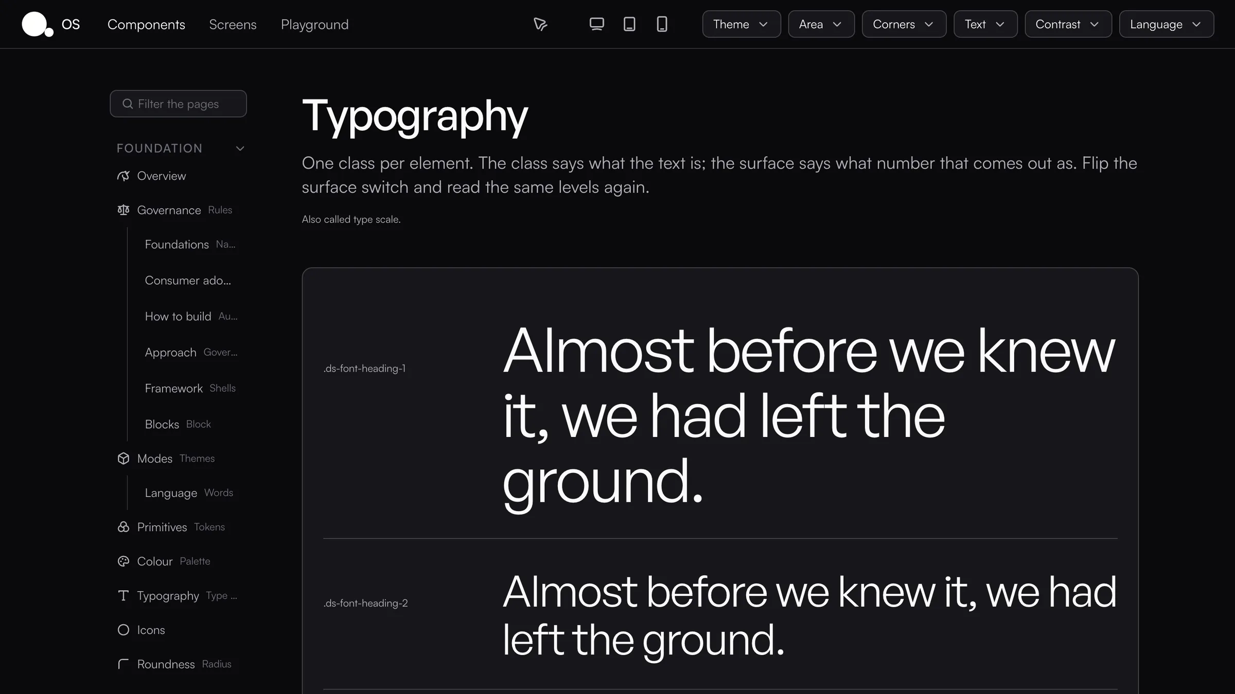
Roles named for where a thing sits, a surface, a line, an ink, never for a component, and each one worked out in light and in dark.
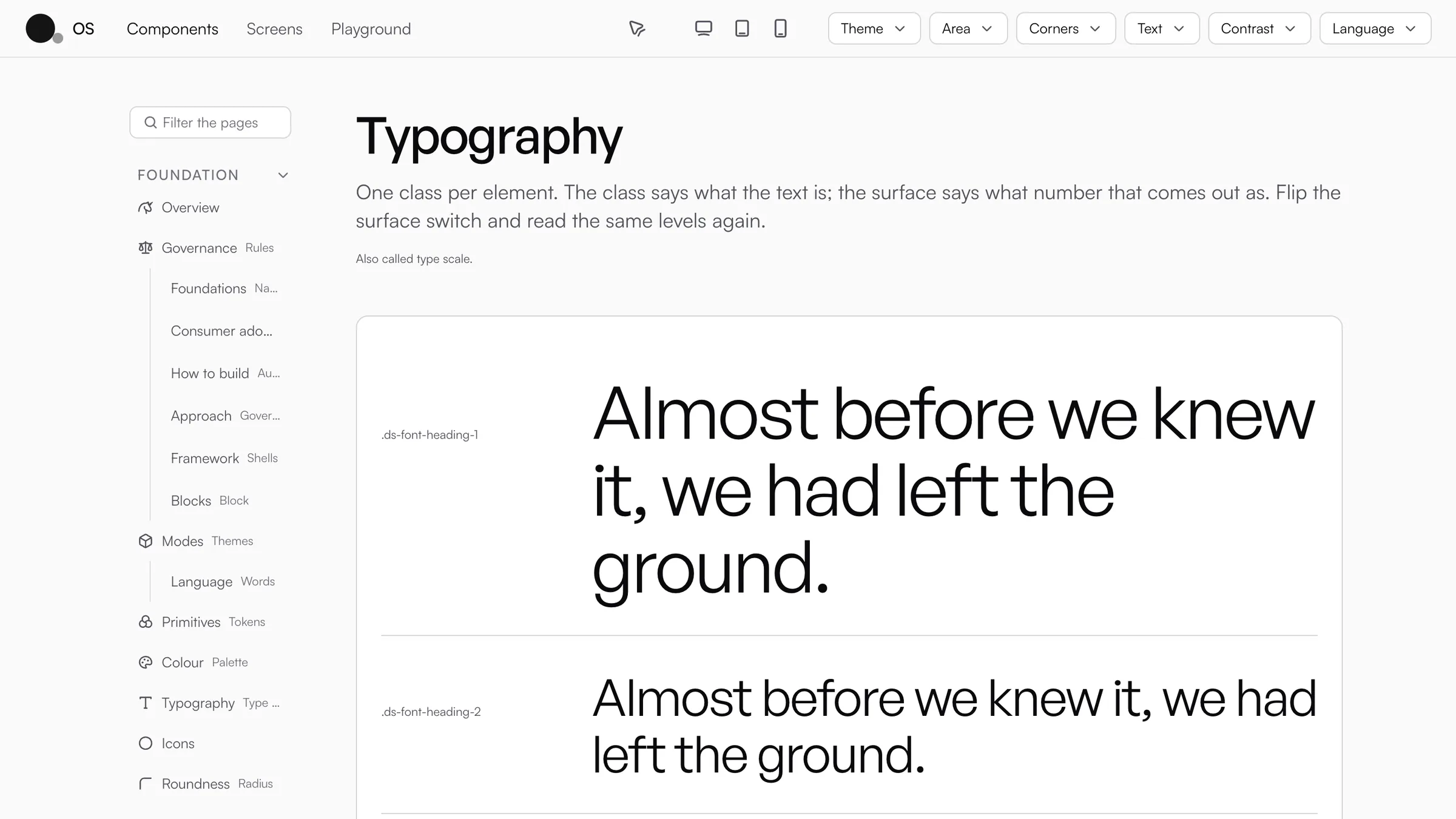
Typography
One class for each level of text, from the largest heading to the smallest label. The class says what the text is, and the surface decides how large it comes out.
Rhythm
The distances a layout reaches for by name. A component never writes a distance of its own.
Tiers
The heights every control stands on, so a button, a field and a strip asked for the same one line up without anybody measuring.
Roundness
One ramp of corners, and how round the whole product is, chosen once, from square to pill.
Layout
Stack, Row and Grid, with named gaps. Each arrangement has one spelling, and there are no utility classes to learn.
Light and dark, from one colour.
Give OS your brand colour and your typefaces. It works out every surface, line and ink from them, in both themes, at a contrast every reader can read.
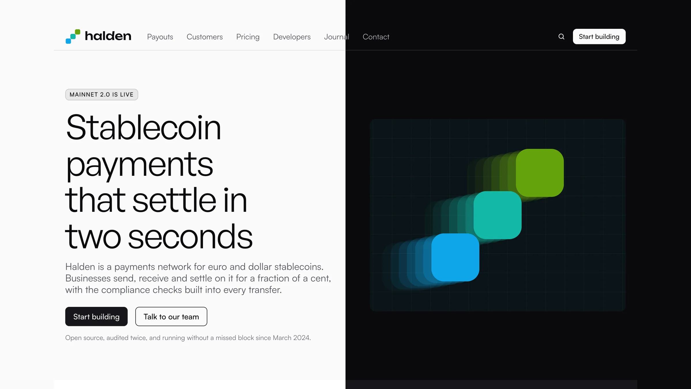
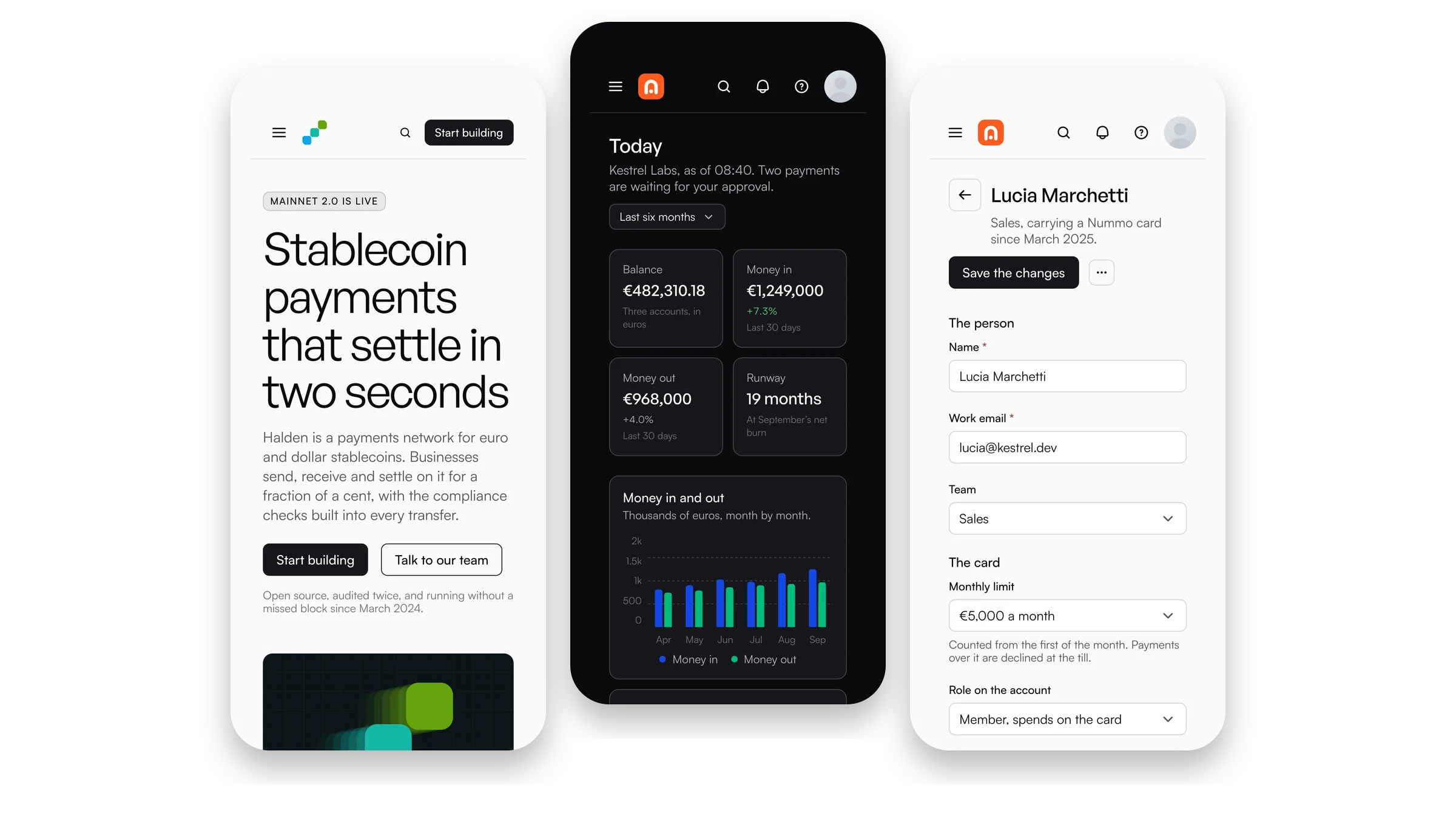
At home on a phone.
Each component measures the room it is given, not the window, so a screen works the same on a phone, in a panel and in a drawer.
Running in three steps.
From the zip to the first screen, and your AI tool building with it.
Install the package
Copy it into your project and install it from the file, or point Composer at its PHP folder.
Import it, then build
One stylesheet at the root of the app, then the components where you use them.
Hand your AI tool the rules
Three files from the zip into your project, and Claude Code, Cursor or Gemini CLI build with OS from the first prompt.
# 1. Install the package
npm install ./vendor/stokefy-os-1.5.1.tgz

# 2. Import it, then build
import '@stokefy/os/css'
import { Button } from '@stokefy/os'

<Button tone="brand">Get started</Button>

# 3. Hand your AI tool the rules
cp ai/AGENTS.md ai/CLAUDE.md ai/GEMINI.md your-project/
What is in the box
React components
Every component with its types, for React 18 and later.
PHP functions
The same components for PHP 8.1 and later, and a small script that gives them their behaviour.
One stylesheet
The tokens, the modes and every component in one file, with no utility classes to learn.
Icons and marks
The interface icons, and the marks of the networks, services and cards a site shows.
Words, translated
Everything a component says on its own, in English, Italian and Spanish.
The source to change and build again, the documentation as a site you open on your own machine, and every screen as code.
Rules for AI tools
AGENTS.md, CLAUDE.md and GEMINI.md for your project, a page for every component, and a live connection over MCP.
A check for your screens
One command that reads your screens and names what breaks the rules, to run before every build.
Pay once.
Start free with Core, then take the whole system for one person or a team of up to ten. Every update after is yours.
Core
For any project, to start with.- 61 components, in React and in PHP
- The stylesheet, the tokens and the modes
- The rules for your AI tools
- Your own projects and your clients’
Personal
For one person, in every project.- Every component, in React and in PHP
- Every screen, ready to copy
- The source and the documentation
- The rules for your AI tools
- Your own projects and your clients’
Team
For up to ten people in one company.- Ten people at once
- Places that move when somebody leaves or joins
- The company’s projects and its clients’
Pay once, by card.
| Feature | Core | Personal | Team |
|---|---|---|---|
| What it holds | |||
| Components, in React and in PHP | 61 | 146 | 146 |
| Screens ready to copy | Not included | 48 | 48 |
| Page sections: hero, features, pricing and more | Not included | Included | Included |
| Shells, tables, boards and charts | Not included | Included | Included |
| The page builder | Not included | Included | Included |
| Brand marks | Not included | 33 | 33 |
| Interface icons | Lucide’s | OS’s own | OS’s own |
| The source, to change and build | Included | Included | Included |
| The documentation, in the zip | Not included | Included | Included |
| For AI coding tools | |||
| AGENTS.md, CLAUDE.md and GEMINI.md | Included | Included | Included |
| A page for every component | Included | Included | Included |
| The live connection over MCP | Included | Included | Included |
| The screen check | Included | Included | Included |
| License | |||
| People | Anyone | One | Up to ten |
| Your projects and your clients’ | Included | Included | Included |
| Every update after | Included | Included | Included |
| Places that move between people | Not included | Not included | Included |
Questions
Every update, dated.
What each release since OS went on sale changed. Your downloads always hold the latest.
Building OS from its source prints in English.
A question an empty chat offers wraps its words inside the thread, and a button can wrap its words, wrap, in both renderers.
A site can turn off the maker OS names on its own: OS_MAKER: 'none' in its next.config, maker('none') in PHP.
A line's or an area's scale can fit its values, scale="fit", in both renderers.
An empty chat can offer questions to tap, starters, in both renderers and the bundle.
A settings rail can wrap on a narrow screen, rail="wrap", in both renderers.
Four numbers stand two by two, never three over one.
The menus, pickers, toasts and tooltips work with a keyboard and a screen reader, in both renderers and the bundle.
An address that would run a script leads nowhere, in both renderers and the bundle.
A chip in a wrapped filter row is never wider than its row.
A line in a menu is grey only under the pointer or the arrow keys.
Build your next product on OS.
Pay once: $199 for one person, $599 for a team of up to ten. React and PHP, the source, the documentation and the rules for your AI tools.